Have you ever stopped to think about the power of colors? They are capable of awakening emotions, transmitting messages, and creating visual harmony. A valuable resource for exploring and understanding colors is the color wheel. It is a visual representation of all available colors organized systematically. If you are a design enthusiast, an artist, or simply someone interested in diving into the world of colors, this article is for you.
In this introductory guide to the color wheel, we will explore everything you need to know about this fascinating concept. We will unravel the secrets of the color wheel and discover how it can elevate your projects and creations to a whole new level. Join us on this journey through the captivating universe of colors!
The color wheel is an essential tool for designers, artists, and professionals in the visual arts. It is composed of a variety of colors organized systematically, allowing for a deeper understanding of chromatic relationships and an effective application of them.
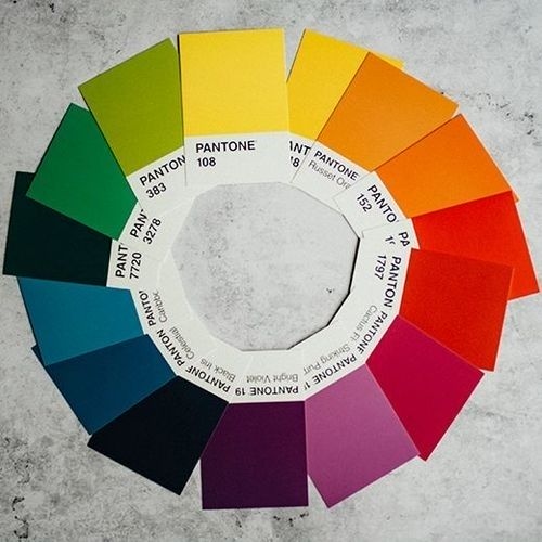
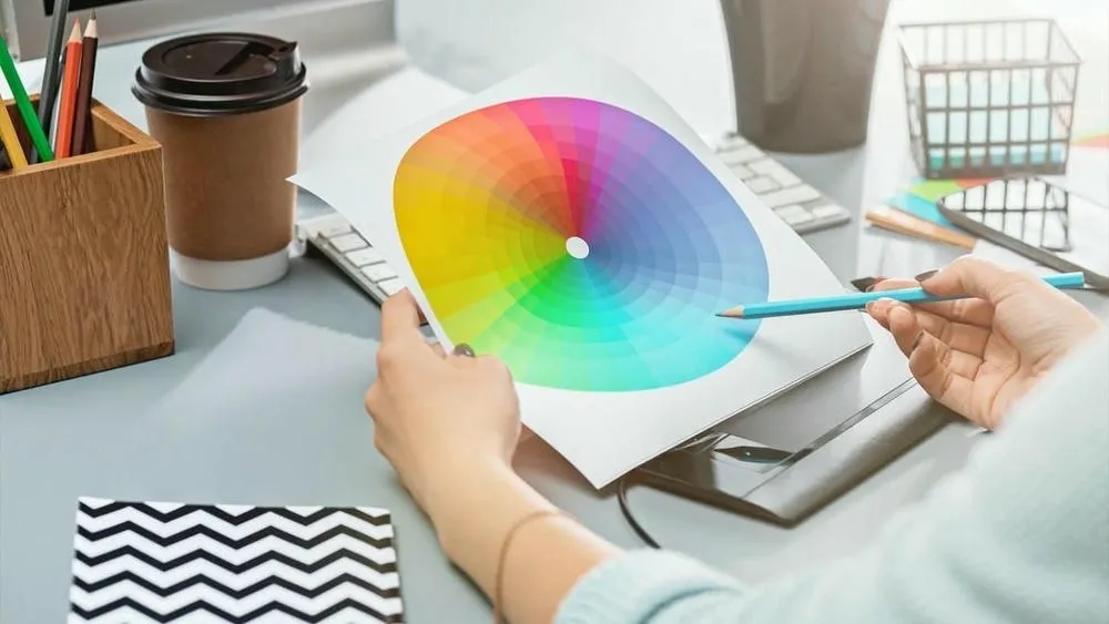
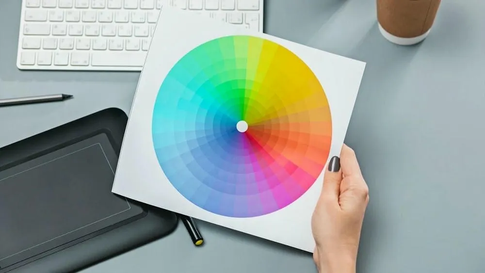
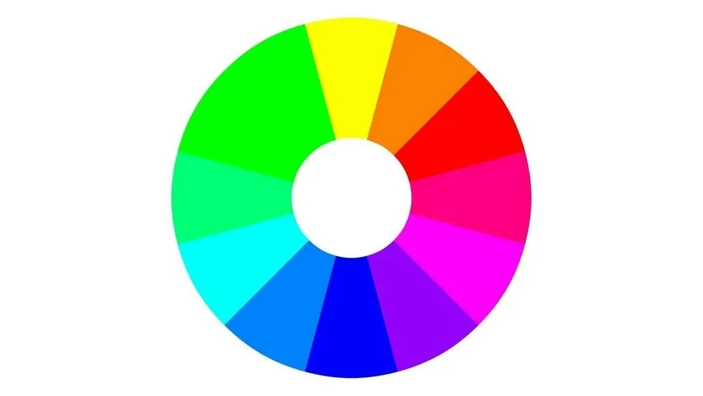
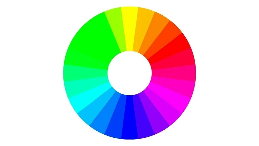
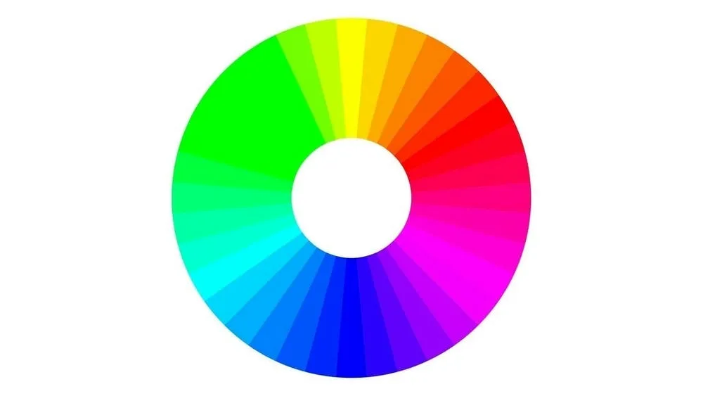
In simple terms, the color wheel is a visual representation of the available colors. It is formed by a circular sequence of pure colors, usually organized into 12 or 24 different tones. These colors are arranged in a way that creates a smooth and harmonious gradient, providing a visual reference for mixing and combining colors.
History and evolution of the color wheel
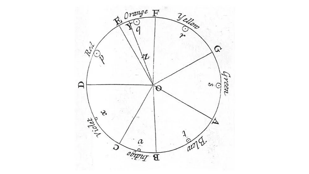
The origin of the color wheel dates back centuries ago, when artists and scientists began to explore color theory. One of the first known records of the color wheel is attributed to Sir Isaac Newton, in the 17th century. Newton studied the decomposition of white light and discovered that it was composed of a series of colors from the visible spectrum.
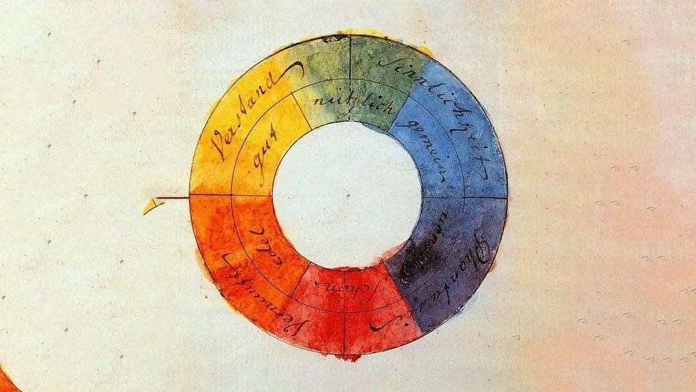
Over time, other artists and color theorists contributed to the evolution of the color wheel. Johann Wolfgang von Goethe, for example, developed a color theory that emphasized the emotional and psychological aspects of colors. These advances led to a deeper understanding of chromatic relationships and the development of more complex color systems.
Importance of the color wheel in design and the arts
The color wheel plays a fundamental role in design and the arts, as it offers guidance in the selection and combination of colors. Understanding the relationships between colors is essential for creating visual harmony, conveying emotions, and effectively communicating messages.
In interior design, for example, the color wheel helps to create balanced color schemes for different spaces. In painting, artists can use the color wheel to explore contrasts and create impactful visual effects. Even in areas like graphic design and fashion, the color wheel is a valuable tool for selecting color palettes appropriate for the objectives and target audience.
In short, the color wheel is an essential tool for artists and designers that provides a visual understanding of colors and their relationships. In the next parts of the article, we will explore in more detail the concepts and practical applications of the color wheel.
Structure of the color wheel
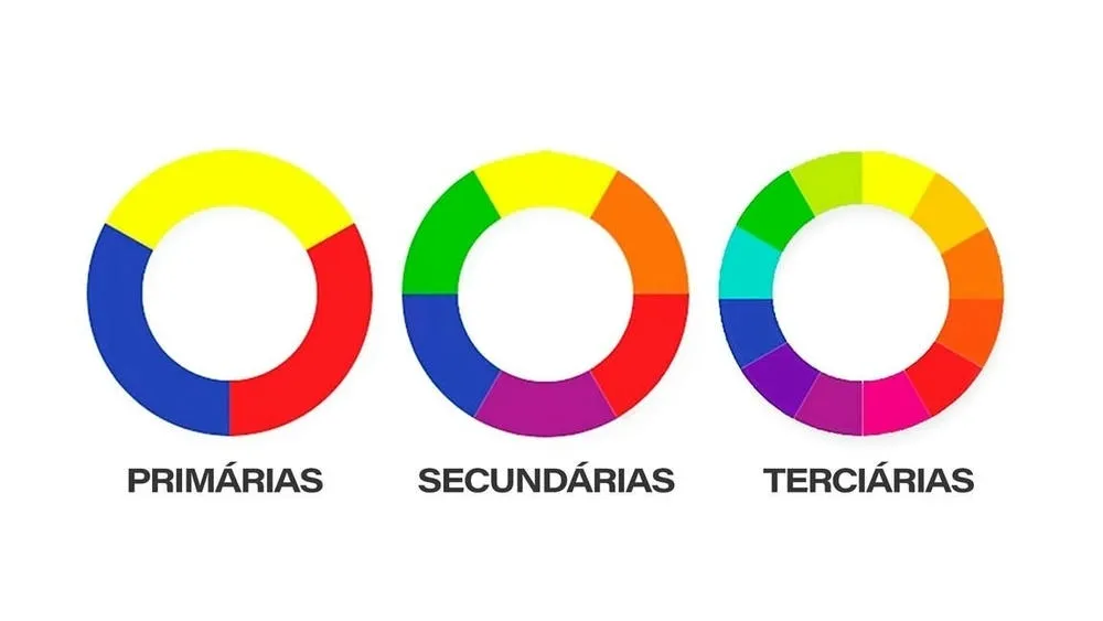
The color wheel is an organized visual representation of colors, used to understand and explore the relationships between them. To understand its structure, it is essential to know the primary, secondary, and tertiary colors.
The primary colors are the basic building blocks of all other colors. They are red, yellow, and blue. These colors cannot be obtained by mixing other colors and are considered pure and fundamental in the color system.
From the primary colors, we can obtain the secondary colors. The secondary colors are formed by the equal combination of the primary colors and are: green (yellow + blue), orange (red + yellow), and purple (blue + red). These colors are positioned between the primary colors on the color wheel.
In addition to the primary and secondary colors, we have the tertiary colors, which are obtained by mixing a primary color with an adjacent secondary color on the color wheel. For example, reddish-purple, yellowish-green, bluish-green, etc. These tertiary colors expand the range of tones available on the color wheel, allowing for a greater variety of combinations.
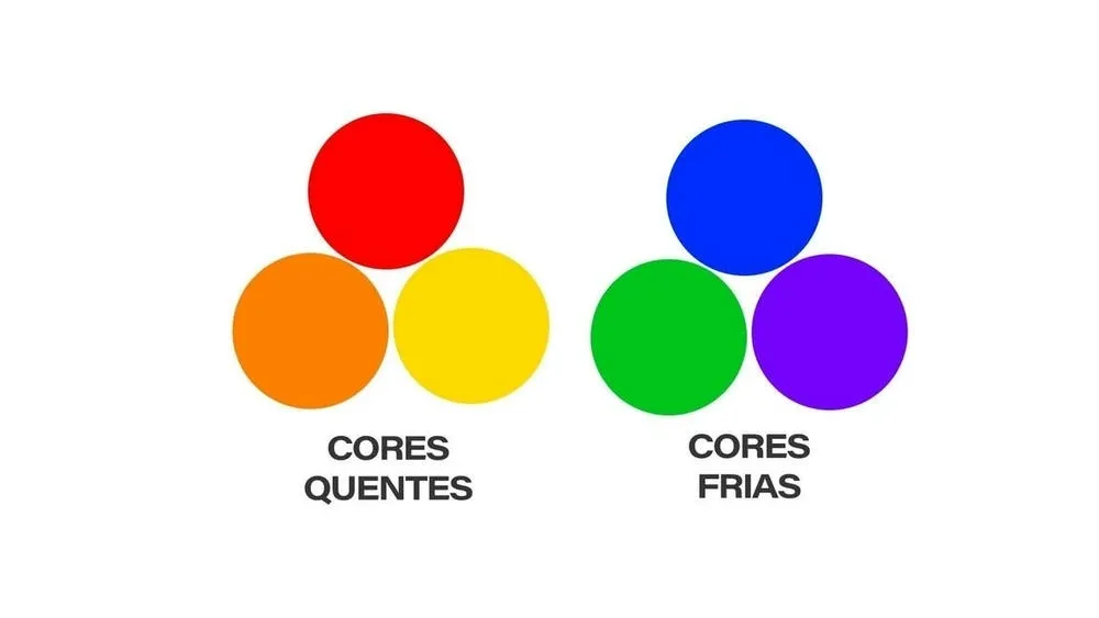
Another important aspect in the structure of the color wheel is the distinction between warm and cool colors. Warm colors are associated with feelings of warmth, energy, and vibrancy. They include shades of red, orange, and yellow. Cool colors, on the other hand, are related to feelings of coldness, calmness, and tranquility. They include shades of blue, green, and purple. This distinction between warm and cool colors is essential for creating different atmospheres and conveying emotions in design projects.
In addition, it is important to mention the color models used in digital representation and printing. The RGB model (Red, Green, Blue) is used in computer displays and other electronic devices. It is based on the addition of these three primary colors to form all other colors. The CMYK model (Cyan, Magenta, Yellow, Black) is used in printing. In this model, the primary colors are cyan, magenta, and yellow, and black is added to enhance the contrast and depth of the colors.
Understanding the structure of the color wheel, the primary, secondary, and tertiary colors, as well as the distinction between warm and cool colors, is essential for exploring harmony and color combinations in design and art projects. In the next section, we will explore the different models of the color wheel and their applications.
Models of the color wheel
There are different models of the color wheel that can be used as a reference in color theory. The traditional color wheel is composed of 12 main colors, but there are also variations with a larger number of colors, such as the 24-color or 36-color wheel. In addition, specific models, such as the Munsell and Itten models, offer more detailed approaches to organizing colors.
Traditional color wheel
The traditional color wheel is composed of 12 main colors, which are the primary, secondary, and tertiary colors. These colors are distributed equally along the circle, forming a harmonious sequence of colors. The traditional color wheel is a common and widely used reference in color theory.
Variations of the color wheel
In addition to the traditional color wheel, there are variations that present a larger number of colors. For example, the 24-color color wheel divides each segment between the main colors into two more intermediate colors. This allows for greater precision in the selection and combination of colors.
There is also the 36-color color wheel, which adds three more intermediate colors between each pair of main colors. These variations offer a wider palette of tones and hues, allowing for a more refined exploration of chromatic relationships.
Specific models of the color wheel
In addition to the variations of the color wheel, there are specific models that have been developed by color theorists to provide a more precise and systematic approach. Two notable examples are the Munsell model and the Itten model.
The Munsell model, created by artist and professor Albert H. Munsell, is based on three dimensions of color: hue, value, and chroma. It organizes colors in a three-dimensional system, allowing for a more precise representation of the variety of colors and their relationships.
The Itten model, developed by artist and educator Johannes Itten, emphasizes the contrasts and harmonies between colors. It presents different color combination schemes, such as complementary contrast, temperature contrast, and value contrast. The Itten model is often used as a reference for creating balanced and impactful color compositions.
These specific models of the color wheel provide more detailed and structured approaches to understanding and applying colors, offering a solid basis for artistic creation and design.
Relationships between colors
Within the color wheel, there are several relationships between colors that can be explored to create harmony and balance in design and art projects. Let's examine some of them:
Complementary Colors: Complementary colors are those that are positioned directly opposite each other on the color wheel. For example, red and green are complementary colors, as are yellow and violet. These contrasting combinations create visual impact and can be used to draw attention or create a dynamic balance in a design.
Analogous Colors: Analogous colors are those that are close to each other on the color wheel. For example, the analogous colors of yellow can be yellowish-green and yellowish-orange. These combinations are visually harmonious, as they have tonal similarities. They can be used to create a cohesive and soft color palette.
Adjacent Colors: Adjacent colors are those that are close, but not necessarily next to each other, on the color wheel. For example, red, orange, and yellow are adjacent colors. These combinations are also harmonious, as they share similar tonal characteristics, allowing for smooth transitions between colors.
By exploring these relationships and color harmonies on the color wheel, you can create interesting and visually pleasing color palettes in your design and art projects.
Practical applications of the color wheel
The color wheel has several practical applications in various creative areas. We mention some of them below:
Use of the color wheel in painting and art in general
In painting and the visual arts, the color wheel is an essential tool for creating harmonious color compositions. Artists can use the relationships between colors, such as complementary, analogous, and adjacent, to create contrasts, balances, and harmonies in their works. By understanding the properties of colors and their interaction on the color wheel, artists can make more informed decisions about selecting and combining colors in their paintings.
Use of the color wheel in interior design
In interior design, the color wheel is a valuable tool for selecting colors for spaces. By considering the atmosphere and objective of the environment, designers can use the chromatic relationships of the color wheel to create appropriate color schemes. Complementary color combinations can be used to add visual interest and create contrasts, while analogous and adjacent colors can be employed to establish a sense of harmony and fluidity. The color wheel also helps in choosing appropriate tones, hues, and intensities for each environment.
Application of the color wheel in graphic design and color palette creation
In graphic design, the color wheel is an essential tool for creating effective color palettes. Designers can use the color relationships on the color wheel to create contrasts, balance, and visual hierarchy in their projects. Understanding color harmonies, such as triads, tetrads, and rectangles, allows for the creation of interesting and balanced color combinations. In addition, the color wheel helps in selecting colors to convey emotions, establish brand identities, and achieve visual communication objectives.
By applying the color wheel in these creative areas, professionals can make more informed and creative decisions regarding colors, resulting in visually appealing and impactful works of art, spaces, and designs.
Psychology of colors
Colors have a powerful psychological and emotional impact on humans. By understanding the psychology of colors, we can use the color wheel to create visual messages and effectively convey meanings. Among the various areas of color psychology, we highlight the main ones below:
Exploration of emotional and psychological associations of colors
Each color carries distinct emotional and psychological associations. For example, red is often associated with passion, energy, and urgency, while blue conveys a sense of tranquility, confidence, and serenity. By understanding these associations, we can use colors strategically to evoke specific emotions and influence the audience's perception.
Influence of colors on human behavior and visual perceptions
Colors also have the power to influence human behavior and visual perceptions. For example, studies have shown that red can increase heart rate and stimulate appetite, while green can convey a sense of freshness and harmony. Designers and marketing professionals can leverage these influences to create environments that stimulate certain actions or to convey specific messages.
Use of the color wheel to create visual messages and convey meanings
The color wheel is a valuable tool for creating visual messages and conveying meanings through colors. By combining different colors from the color wheel, we can create contrasts, harmonies, and visual balance. In addition, the careful choice of colors can reinforce brand identity, convey a sense of confidence and professionalism, or awaken specific emotions in the target audience.
By exploring the psychology of colors and using the color wheel strategically, we can create designs and visual messages that are effective, captivating, and impactful.
Practical examples and case studies
A great way to understand the power and application of the color wheel is to analyze practical examples and case studies. In this section of the article, we will address how the color wheel is used in famous works of art, successful designs, and inspiring color palettes.
Analysis of famous works of art and how they use the color wheel
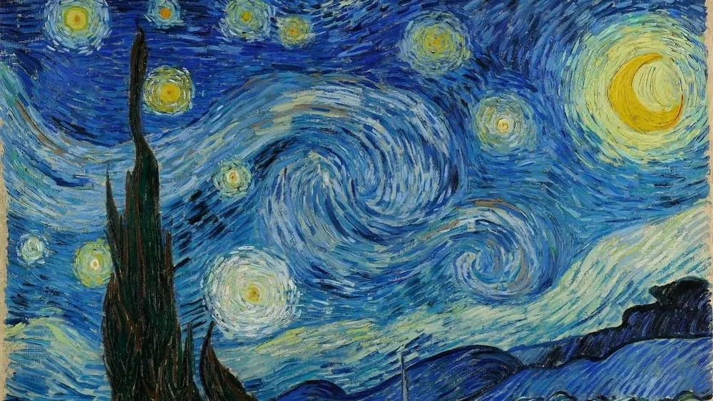
Many famous works of art consciously and creatively use the color wheel to convey messages, create atmospheres, and evoke emotions. For example, in Vincent van Gogh's famous painting "Starry Night," the artist uses a combination of complementary colors, such as blue and yellow, to create contrast and dynamism in the composition. Analyzing these works of art allows us to understand how artists explore the color wheel to create visual impact.
Case studies of successful designs based on the color wheel
Many successful designs, whether logos, packaging, or websites, are based on the color wheel to create strong and memorable visual identities. An example of this is the FedEx logo, which uses a combination of complementary colors, orange and purple, to create contrast and draw attention. Case studies like this demonstrate how the strategic use of the color wheel can contribute to the success of a design.
Examples of inspiring color palettes and their relationship with the color wheel
There is an infinity of inspiring color palettes available, many of which can be related to the color wheel. For example, a color palette with shades of blue, green, and yellow can be based on the analogous colors of the color wheel, creating a sense of harmony and visual balance. Examining these examples of inspiring color palettes allows us to visualize how different combinations on the color wheel can be applied in design projects.
By studying practical examples and case studies related to the color wheel, you will broaden your knowledge of its application and be better prepared to create impactful and harmonious designs.
Exercises and activities to practice with the color wheel
In addition to understanding the theory of the color wheel, it is important to practice and experiment with color relationships to deepen your knowledge. Here are some practical activities and exercises that can help you explore and better understand the colors on the color wheel:
Creating color palettes: Choose a specific theme or project, such as a logo design or a painting, and create different color palettes based on the color wheel. Explore different color combinations, such as analogous, complementary, or triadic colors. Observe how each palette creates a different atmosphere and feeling.
Experimenting with color mixing: Use paints or image editing programs to practice color mixing. Start with the primary colors (red, blue, and yellow) and mix them to create secondary colors (purple, green, and orange). Then, explore mixing secondary colors to create tertiary colors. This activity will help you understand how colors relate and transform on the color wheel.
Developing a monochromatic project: Choose a color on the color wheel and develop a project using shades and variations of that color. It can be a painting, a graphic design, or an interior design project. Explore different intensities and saturation of the chosen color. This will allow you to better understand the variations within a single color and how it can be used effectively.
Recreating famous works of art: Choose a famous work of art that uses the color wheel in an interesting way and try to recreate it. It can be a painting, a drawing, or a photograph. By recreating the work, you will have the opportunity to study the artist's color choices and understand how they contribute to the overall composition of the work.
Studying color harmonies: Choose a type of color harmony, such as complementary harmony, analogous harmony, or triadic harmony, and develop a series of small compositions or designs using that specific harmony. Explore how the colors relate and how they can create different visual effects.
These exercises and practical activities will help you put the concepts of the color wheel into practice and develop a deeper understanding of color relationships. Remember to have fun and experiment during the process!
Final considerations and tips for using the color wheel
In this article, we explored the fascinating world of the color wheel and its importance in design and the arts. We reviewed the main concepts and applications, discussed the structure of the color wheel, the models and tools related to it, the relationships between colors and their psychology, as well as practical examples and activities to enhance your understanding.
Here are some additional tips for using the color wheel effectively:
Experiment and practice: The best way to understand the color wheel is by experimenting and practicing with colors. Don't be afraid to experiment and explore unusual combinations. Through practice, you will develop a more trained eye for using colors.
Observe the context: Consider the context in which the colors will be used. Colors can have different meanings in different cultures and can evoke distinct emotions in different contexts. Take into account the target audience, the purpose of the design or work of art, and adapt the color choices accordingly.
Balance and contrast: Seek visual balance and appropriate contrast between colors. Balance creates harmony, while contrast adds interest and emphasis. Experiment with complementary, analogous, or triadic color combinations to achieve different levels of contrast.
Use the color wheel as a guide, not a rigid rule: The color wheel is a useful tool, but remember that creativity should not be limited by rigid rules. Use the color wheel as a guide, but allow yourself to explore beyond it and develop your own style.
Finally, get inspired! Color is a powerful form of communication and expression. Explore different works of art, designs, and environments to get inspired by color choices and combinations. Be open to new experiences and discover how colors can transform your projects and creations.
Remember that understanding and mastering the color wheel is an ongoing process. The more you practice and experiment, the deeper your knowledge of colors and their application in the arts and design will be. We hope this article has provided a comprehensive overview of the color wheel and its applications. Now it's time to dive into this wonderful world of colors and let your creativity flow!
ArchShop is redefining the concept of residential architecture in Brazil, making high-quality projects accessible to everyone. Combining over 20 years of expertise in the construction sector with technological innovation, the company offers a complete digital platform that simplifies and democratizes the process of building the dream home.
We believe that the best ideas arise from the exchange of experiences and the sharing of different perspectives. Open the doors to new opportunities and be part of our blog! If you have an interesting article, an amazing work, a product or service that deserves to be highlighted, contact us.