Archshop,
Jul 1, 2026
How to Optimize Small Spaces in Apartments and Houses
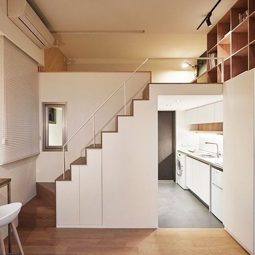
In this article, we will share valuable tips on how to optimize small spaces in apartments and houses.
 https://creativecommons.org/licenses/by-nc-nd/4.0/https://creativecommons.org/licenses/by-nc-nd/4.0/ArchShopArchShop
The 60-30-10 rule is one of the main strategies used in architecture and interior decoration.
The 60-30-10 rule is one of the main strategies used in architecture and interior decoration. This rule consists of dedicating 60% of a space's color palette to a dominant color, 30% to a complementary color, and 10% to an accent color.
The dominant color is the color that will be used in most of the space, creating a sense of harmony and balance. The complementary color is used in a smaller amount to add depth and visual interest to the space. And the accent color is used in small details, such as cushions, curtains, and decorative objects, giving a touch of personality to the environment.
The 60-30-10 rule is a great way to create a cohesive and balanced color palette in any space. It is easy to follow and ensures that the space is harmonious and attractive, without being overwhelmed by unnecessary colors.
In addition, the 60-30-10 rule can also be applied to textures, materials, and shapes present in the space. For example, 60% of the furniture and objects can have straight lines, 30% can have curved lines, and 10% can have rounded shapes.
The 60-30-10 rule is a great strategy for those starting in interior decoration, as it helps create a harmonious and cohesive space without the need for a large amount of knowledge or skill in architecture and decoration.
However, it is important to remember that the 60-30-10 rule is not a rigid rule and can be adapted to your personal needs and preferences. The important thing is to find a combination of colors and textures that works for your space and conveys the sense of harmony and balance you desire.

The 60-30-10 rule is a widely used strategy in architecture and interior decoration that has many advantages. This rule suggests that 60% of a space's color palette be dedicated to a dominant color, 30% to a complementary color, and 10% to an accent color. Here are some of the advantages of using the 60-30-10 rule in architecture:
The 60-30-10 rule ensures that a space's color palette is balanced and harmonious, preventing one color from being overly dominant or obscuring the others. This is important to ensure that the decoration is pleasing to the eye and helps create a sense of calm and tranquility.
The 60-30-10 rule allows an accent color to be used to highlight key features of the space, such as a wall or an object. This adds visual interest and personality to the space.
The 60-30-10 rule offers a clear structure for choosing colors, which can be useful for people who do not have much knowledge about decoration. In addition, the rule is flexible enough to allow for the creation of a variety of styles and themes, from classic to modern.
The 60-30-10 rule is a good basis for future adjustments in interior decoration, as it allows the addition of new colors and textures without compromising the harmony of the space.
The 60-30-10 rule can be applied to different types of spaces, including bedrooms, living rooms, kitchens, bathrooms, and more.
The 60-30-10 rule is a versatile and effective strategy for architecture and interior decoration that offers many advantages, including creating harmony and balance, facilitating color choice, and being applicable to different types of spaces. For these reasons, it is a popular choice for many professionals and interior design enthusiasts.
The 60-30-10 rule is a widely used strategy in architecture and interior decoration. This rule suggests that 60% of a space's color palette be dedicated to a dominant color, 30% to a complementary color, and 10% to an accent color.
To illustrate how the 60-30-10 rule works in practice, let's give some examples of how to apply this strategy in different spaces.

For a living room, you can choose a dominant color of light gray tones for the walls and main furniture. The complementary color can be a soft green tone to add depth and visual interest to the space. Finally, the accent color can be a vibrant yellow to give a touch of personality to the room.

For a kitchen, you can choose a dominant color of white for the walls and main furniture. The complementary color can be a dark blue to add depth and visual interest to the kitchen. Finally, the accent color can be a vibrant red to give a touch of personality to the kitchen.

For a bedroom, you can choose a dominant color of light pink tones for the walls and main furniture. The complementary color can be a soft blue to add depth and visual interest to the bedroom. Finally, the accent color can be a vibrant green to give a touch of personality to the bedroom.
As you can see, the 60-30-10 rule can be applied to any space, regardless of size or style. The key is to choose colors that work together and create the sense of harmony and balance you desire. In addition to colors, the 60-30-10 rule can also be applied to textures, materials, and shapes present in the space.
We remind you that the 60-30-10 rule is not a rigid rule, and can be adapted according to personal preferences and the style of each space. The main idea is to provide a basis for choosing colors and help create harmony and balance. It is possible to create attractive, functional, and aesthetically pleasing spaces. In addition, this strategy is a valuable tool to help with decisions about colors and interior design.
 https://creativecommons.org/licenses/by-nc-nd/4.0/https://creativecommons.org/licenses/by-nc-nd/4.0/ArchShopArchShop
ArchShop is redefining the concept of residential architecture in Brazil, making high-quality projects accessible to everyone. Combining over 20 years of expertise in the construction sector with technological innovation, the company offers a complete digital platform that simplifies and democratizes the process of building the dream home.
See also
In this article, we will share valuable tips on how to optimize small spaces in apartments and houses.
Explore 23 projects with a gourmet space, from compact houses to high-end models with a pool and barbecue. Find the perfect plan for your home!
In this article, we will highlight the trends that continue to evolve, while also presenting some exciting new developments in the field of architecture, interior design, and decoration.

In the world of colors, there are three main categories that describe their visual and emotional characteristics: warm, cool, and neutral colors.
Advertise or Publish
We believe that the best ideas arise from the exchange of experiences and the sharing of different perspectives. Open the doors to new opportunities and be part of our blog! If you have an interesting article, an amazing work, a product or service that deserves to be highlighted, contact us.