Archshop,
Jul 1, 2026
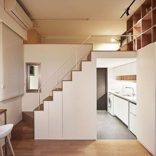
How to Optimize Small Spaces in Apartments and Houses
In this article, we will share valuable tips on how to optimize small spaces in apartments and houses.
 https://creativecommons.org/licenses/by-nc-nd/4.0/https://creativecommons.org/licenses/by-nc-nd/4.0/ArchShopArchShop
In this article, we explore the use of warm colors in architecture.
Warm colors play a fundamental role in architecture, creating atmospheres, evoking emotions, and conveying symbolic meanings. In this article, we explore the use of warm colors in architecture, addressing everything from an introduction to the concept and warm colors to their application in different techniques and styles. We also analyze the psychology behind warm colors and their effects on the mood and perception of occupants of an architectural space.
With this research on warm colors in architecture, this article aims to provide a comprehensive and inspiring view on how these colors can be used to create pleasant, functional, and culturally relevant spaces.

Colors are powerful elements in architecture, capable of evoking emotions, conveying sensations, and creating unique atmospheres. A widely explored approach is the use of warm colors, which play a fundamental role in creating emotional impacts in architectural spaces.
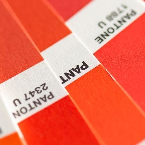
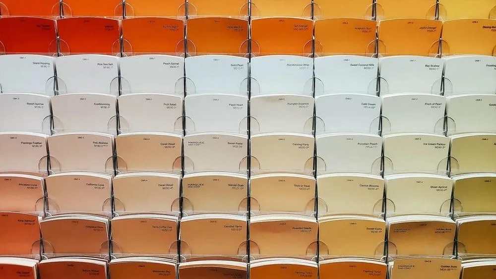
Warm colors are those we associate with the sun, fire, and heat. They are mainly found in the spectrum ranging from red to yellow, including shades of orange and brown. These colors are known for conveying sensations of warmth, energy, passion, and vitality. Unlike cool colors, which are calmer and more tranquil, warm colors have a stimulating and dynamic quality.
The basic warm colors are yellow, orange, and red.
A warm color can be identified in technical terms by considering its color temperature and position on the chromatic spectrum. Here are some characteristics that can help identify a warm color:
However, it is important to note that the perception of colors can vary from person to person, and the interpretation of a color as "warm" can also be influenced by cultural and contextual factors.
The warmest color on the spectrum is violet, specifically bluish-violet, also known as blue-violet. This is because bluish-violet has the highest frequency and energy within the visible spectrum of colors. However, it is important to mention that color temperature is not an absolute scale of physical heat, but rather a way of describing the appearance of colors in relation to each other. In terms of emotional associations, red is often considered the warmest color, as it evokes a feeling of intense heat and burning energy.
Classifying a color as warm or cool is not an objective measure, but rather a subjective interpretation based on our visual and cultural experience. Generally, warm colors are associated with feelings of warmth, energy, and activity, while cool colors are associated with feelings of coldness, calm, and tranquility.
In the case of purple, different shades can evoke different feelings. Shades of purple can be classified as warm or cool because they contain both blue and red. Tones of more reddish purple, such as magenta or dark purple, tend to be classified as warm. These tones are close to red on the color wheel and, therefore, can convey a sense of warmth and intensity. On the other hand, tones of more bluish purple, such as lavender or lilac, are often considered cool colors. These tones are close to blue on the color wheel and, like blue, tend to convey a sense of freshness and serenity.
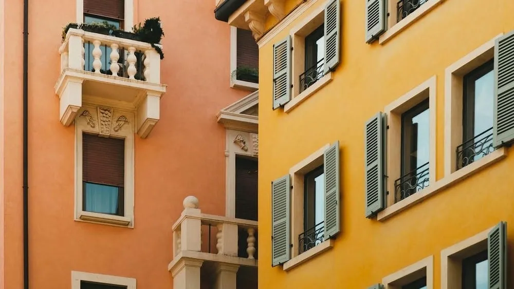
In architecture, warm colors are used strategically to create a variety of atmospheres and emotional impacts in spaces. For example, by using reddish tones in a room, you can create a feeling of warmth and coziness, perfect for residential spaces like living rooms and bedrooms. Red can also be used in commercial spaces, such as restaurants and cafes, to stimulate appetite and create an inviting environment.
Furthermore, warm colors are often applied in highlight areas or focal points in architectural projects. By using a vibrant orange tone on a wall, for example, it is possible to draw attention to a specific element, such as a work of art or a decorative object.
It is important to note that the use of warm colors in architecture requires balance and care. An excess of warm tones can result in a visually oppressive and tiring environment. Therefore, it is essential to consider a harmonious combination with neutral and cool colors in order to create a balanced and pleasing palette to the eyes.
Colors have a powerful psychological impact on humans, influencing mood, energy, and the perception of occupants of a room. But what do warm colors awaken in people?

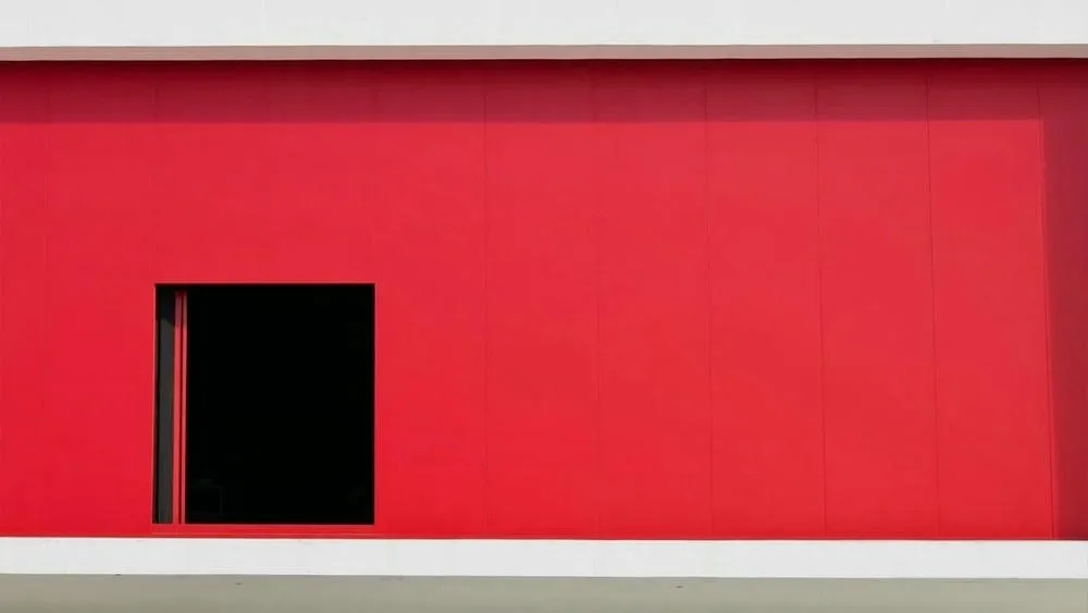
Red, for example, is an intense color that awakens strong emotions. It is associated with love, passion, and energy. When used in architecture, red can create a stimulating and welcoming atmosphere. In commercial spaces, such as gyms, red is often used to stimulate energy and motivation in visitors. However, it is important to use red in moderation, as in excess it can generate agitation and irritation.

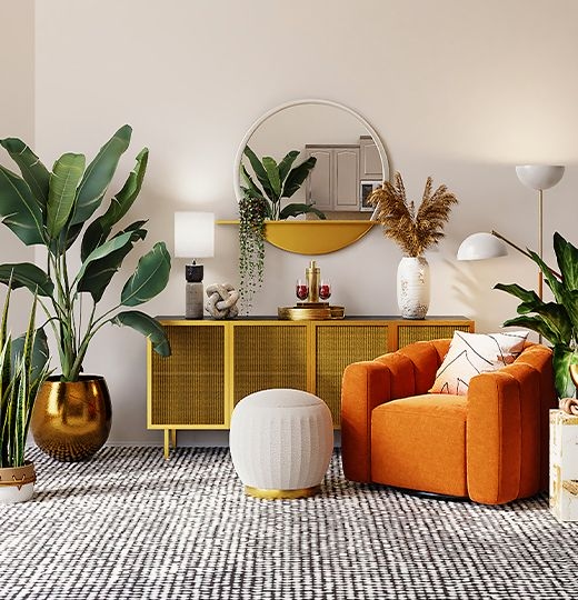
Orange is a cheerful color that evokes enthusiasm, creativity, and vitality. In architecture, orange can be used to convey a sense of warmth and comfort. It is a color often chosen for common areas, such as living rooms or leisure areas, as it promotes an inviting and friendly atmosphere. In addition, orange can also be used in workspaces, as it stimulates creativity and optimism.

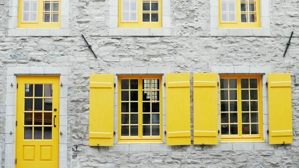
Yellow is a color associated with sunlight, being a symbol of joy, optimism, and happiness. When used in architecture, yellow can create vibrant and energetic spaces. It is a color commonly chosen for environments such as kitchens and dining areas, as it stimulates appetite. However, yellow in more intense tones can be too stimulating and cause restlessness. It is recommended to use it in combination with softer colors or in specific highlight areas.
When using warm colors in architecture, it is important to consider the purpose and function of the space, as well as the target audience. Warm colors can create distinct emotional impacts and influence the perception of occupants. However, moderation is key to avoid unwanted effects.
The presence of warm colors in human history is a remarkable phenomenon that can be observed in various cultural manifestations around the world. Warm colors, such as red, orange, and yellow, have vibrant and intense characteristics, evoking strong emotions and attracting people's attention. These colors have been widely used in architecture throughout the ages, playing significant roles both symbolically and aesthetically.

In many cultures, red is associated with a variety of meanings, such as passion, power, luck, and prosperity. In traditional Chinese architecture, for example, red is a symbolic color that represents good luck and fortune. Temples, palaces, and important buildings often feature red details in their structures, such as doors, windows, and ornamental decorations. These red elements help to create an auspicious and solemn atmosphere, connecting with the cultural beliefs and traditions of China.

Similarly, orange also plays a culturally significant role in various parts of the world. In India, for example, orange is associated with Hinduism and Buddhism, representing spirituality and renewal. Hindu and Buddhist temples often feature orange details on their facades and interiors, creating a sacred and inviting atmosphere. In addition, orange is frequently used in festivals and religious celebrations, where people dress in clothes of this color to show their devotion and joy.

Yellow, in turn, is widely used in architecture as a color that evokes optimism, happiness, and energy. In the Spanish colonial architecture found in Latin America, especially in Mexico, yellow is an iconic color present in many historic buildings. This vibrant color creates a cheerful and welcoming atmosphere in the streets and squares, reflecting the lively and festive culture of the region.
Warm colors not only add vibrancy and visual expression to buildings, but also play a fundamental role in how people experience and perceive architectural spaces. They can influence mood, stimulate creativity, and create an emotional connection between people and the built environments.

The use of warm colors in contemporary architecture has undergone a significant evolution. In recent decades, there has been a return to the use of natural materials and the appreciation of authenticity in architecture. This has been reflected in the use of natural warm colors, such as terracotta, clay tones, and woods rich in warm tones. These colors bring a sense of connection with nature and promote a cozy and welcoming atmosphere in architectural spaces.
A contemporary trend in architecture is the use of warm colors in minimalist spaces with a focus on contrast. In projects where neutral tones and clean surfaces predominate, the strategic use of elements in warm colors, such as furniture, decorative objects, or even architectural details, creates a vibrant and impactful focal point. This approach adds warmth and personality to the space, without compromising the simplicity and elegance of the design.
The combination of warm and cool colors has been creatively explored in contemporary architecture. By mixing warm colors, such as red or orange, with cool tones, such as blue or green, architects are able to create contrasts and visual balance. This approach allows for the expression of different emotions and creates a sense of dynamism and movement in architectural spaces.
Lighting plays a fundamental role in how warm colors are perceived in contemporary architectural spaces. Artificial lighting allows for the creation of dramatic effects, highlighting specific areas and enhancing the intensity of warm colors. Through directed lighting techniques, such as spotlights or LED strips, it is possible to accentuate architectural elements, creating a play of light and shadow that emphasizes the presence of warm colors.
The concern for sustainability has driven the use of natural warm colors and ecological materials in contemporary architecture. Natural pigments extracted from plants and minerals have been used to create authentic and sustainable warm colors. This approach highlights the connection with nature, promotes the conscious use of resources, and creates visually appealing and ecologically responsible architectural spaces.
The evolution of the use of warm colors in contemporary architecture reflects the search for a balance between tradition and innovation, authenticity and minimalism, as well as care for the relationship with the environment. These trends have driven the creative use of warm colors, resulting in more pleasant and impactful architectural projects.
Understanding the use of warm colors in architecture is essential for architects, designers, and all those involved in the creation of habitable spaces. Through mastery of these colors, it is possible to create environments that are not only aesthetically pleasing but also provide an emotional connection with the people who inhabit them.
We hope this article serves as a source of inspiration and guidance for exploring the richness and potential of warm colors in architecture! May it encourage the search for harmony, creative experimentation, and the enrichment of architectural spaces with vibrant and powerful warm colors.
 https://creativecommons.org/licenses/by-nc-nd/4.0/https://creativecommons.org/licenses/by-nc-nd/4.0/ArchShopArchShop
ArchShop is redefining the concept of residential architecture in Brazil, making high-quality projects accessible to everyone. Combining over 20 years of expertise in the construction sector with technological innovation, the company offers a complete digital platform that simplifies and democratizes the process of building the dream home.
See also
In this article, we will share valuable tips on how to optimize small spaces in apartments and houses.
Explore 23 projects with a gourmet space, from compact houses to high-end models with a pool and barbecue. Find the perfect plan for your home!
In this article, we will highlight the trends that continue to evolve, while also presenting some exciting new developments in the field of architecture, interior design, and decoration.

In the world of colors, there are three main categories that describe their visual and emotional characteristics: warm, cool, and neutral colors.
Advertise or Publish
We believe that the best ideas arise from the exchange of experiences and the sharing of different perspectives. Open the doors to new opportunities and be part of our blog! If you have an interesting article, an amazing work, a product or service that deserves to be highlighted, contact us.