Archshop,
Jul 1, 2026
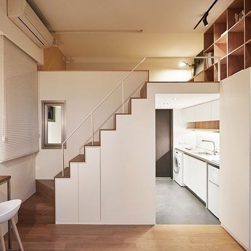
How to Optimize Small Spaces in Apartments and Houses
In this article, we will share valuable tips on how to optimize small spaces in apartments and houses.
 https://creativecommons.org/licenses/by-nc-nd/4.0/https://creativecommons.org/licenses/by-nc-nd/4.0/ArchShopArchShop
Neutral colors are shades that are at an intermediate point between warm and cool colors, having no predominant hue. They are subtle and versatile colors.
Neutral colors are shades that are at an intermediate point between warm and cool colors, having no predominant hue. They are subtle and versatile colors, which do not attract much attention on their own, but have the power to complement and balance other colors in a visual composition. In this article, we will address the applications of neutral tones in architecture, what these colors awaken in people, and how they can be used to create new perceptions of space.

Neutral colors are generally associated with black, shades of gray, beige, brown, and white. They can also include variations of softer colors, such as light blue, pale green, or pastel pink. These shades are considered neutral because they do not have an intense chromatic temperature, being more discreet and less vibrant compared to more intense and saturated colors.
One of the main characteristics of neutral colors is their ability to harmonize with almost all other colors, creating a balanced background that allows other colors to stand out. They are often used in interior design projects, fashion, graphic design, and other creative areas, due to their ability to convey a sense of elegance, sophistication, and serenity.
Furthermore, neutral colors also have the advantage of being timeless, that is, they do not follow passing trends and remain relevant for long periods. They are considered a safe choice when looking for a classic and sophisticated color palette that will not become obsolete quickly.
The basic neutral colors are black, white, and gray.
The most neutral color is gray. Gray is a color that results from the balanced mixture of black and white, having no specific hue. It is considered neutral because it does not have a perceptible tendency towards any other color, making it a versatile and neutral choice in most applications. Gray can vary in shades, from light gray to dark gray, offering a wide range of neutral options for different uses.

To identify a neutral color, it is important to consider the hue, color temperature, brightness, saturation, and emotional associations. Here are some characteristics that can help in this identification:
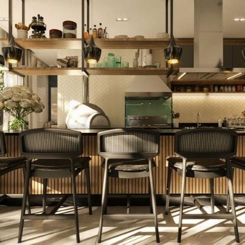
In architecture, neutral colors play a fundamental role in creating balanced, elegant, and timeless environments. By using neutral colors in architecture, you create a neutral base that can be complemented with decorative elements and colored furniture. These colors are often chosen for their ability to harmonize with a wide variety of styles and materials, allowing the architectural design to stand out without becoming overly dominant.
One of the main advantages of neutral colors is their versatility. They are able to create a sense of calm and serenity in spaces, as well as a welcoming and inviting atmosphere. In addition, neutral colors are able to highlight other elements of the design, such as textures, shapes, and materials, giving them prominence and visual balance.
Another benefit of neutral colors is that they tend to age well over time. Unlike strong colors and passing trends, neutral colors are timeless and can withstand changes in fashion and style. This makes neutral colors a safe choice for long-term investments in architectural projects.
When choosing neutral colors for an architectural project, it is important to consider the lighting of the space, the surrounding context, and the desired objective. For example, in an environment with plenty of natural light, lighter shades of white, beige, or gray can be used to expand the sense of brightness. In contrast, in smaller or more intimate spaces, darker shades of gray or brown can create a more welcoming and cozy atmosphere.
Neutral colors, such as black, white, and gray, have distinct characteristics and can arouse different emotional responses in people when used in architecture. Here are some common associations related to these colors:

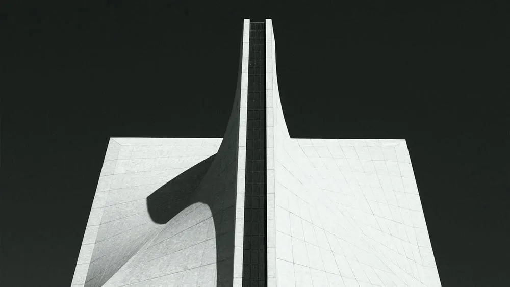
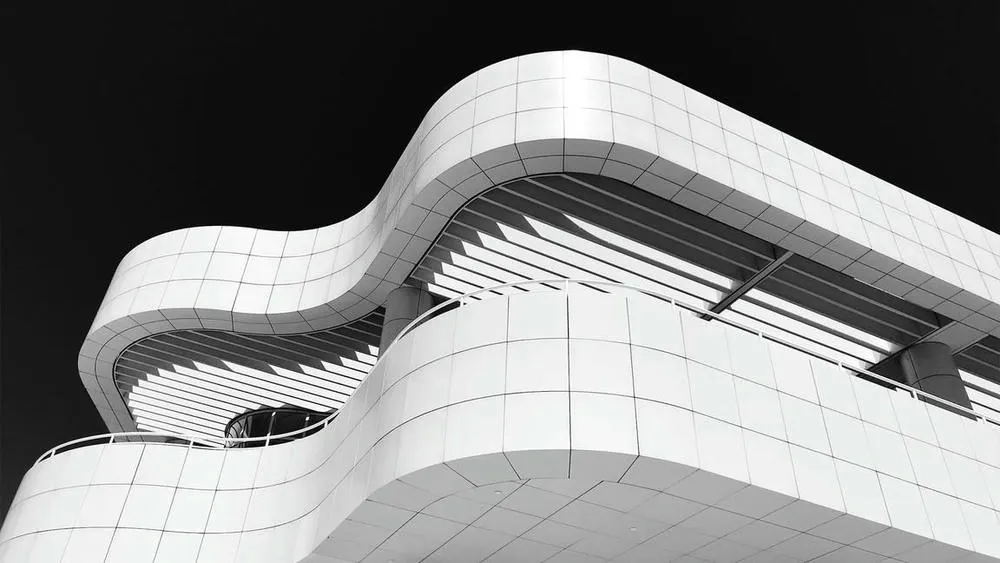
Black is generally associated with sophistication, elegance, formality, and power. It is a color that can convey mystery and authority. In architecture, black can be used to create striking contrasts and highlight important architectural elements. However, its excessive or inappropriate use can create a feeling of oppression or sadness.

White is often associated with purity, simplicity, peace, and clarity. It is a neutral color widely used in architecture, as it helps to create a sense of brightness, spaciousness, and cleanliness. White can also convey a feeling of calm and serenity. However, excessive use of white can seem impersonal or sterile.

Gray is a color that is between black and white, and is often associated with neutrality, stability, and balance. It is a versatile and commonly used color in architecture, as it can complement other tones and create a sophisticated environment. Gray can convey a sense of seriousness and formality, but it can also seem monotonous if not used properly.
It is important to note that emotional responses to colors can vary according to cultural context, personal experiences, and individual preferences. In addition, the combination and contrast between neutral colors and other colors can further influence perception and emotional impact in architecture.
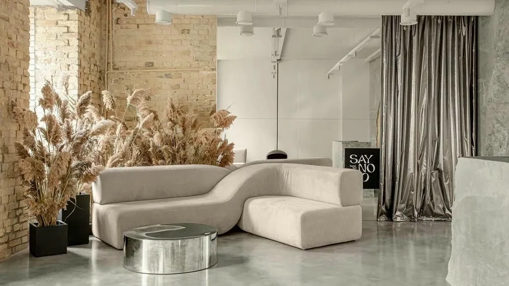
Neutral colors are widely used in interior and exterior architecture due to their versatility and ability to create calm, elegant, and timeless environments. Here are some techniques for using neutral colors and how they can be applied in indoor and outdoor settings:
Remember that balance is key when using neutral colors. Varying tones and textures can add depth and visual interest, even in a neutral palette. Experiment with different combinations and elements to find the style that best suits the environment you want to create.
The use of neutral colors can play an important role in manipulating and creating sensations of space, brightness, size, and perspective in an environment. Neutral colors, such as shades of white, gray, and beige, have the ability to influence visual perception in a subtle but significant way. Here are some ways in which neutral colors can help create sensations of space, brightness, size, and perspective:
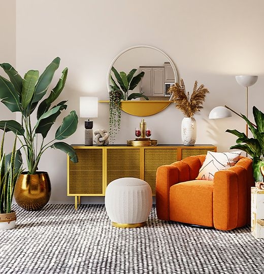
In addition, neutral colors can also serve as a neutral base for other design elements, such as furniture, accessories, and works of art. By keeping the colors of the walls and floors in neutral tones, these elements can stand out and create interesting focal points in the space.

Neutral colors, such as black, white, and gray, have played significant roles in cultures around the world throughout the history of architecture. Let's explore some cultural and historical aspects related to each of these colors:
Black has been associated with different cultural meanings in various civilizations. In architecture, the use of black often evokes a sense of solidity, power, and elegance. In Western culture, it is often associated with mourning and seriousness. For example, during the Renaissance, the use of black marble in buildings and funeral monuments was common. In contemporary architecture, black is often used to convey a sense of modernity and sophistication.
White is a color often associated with purity, innocence, and peace. In architecture, the use of white can create a clean and fresh appearance, as well as emphasize the form and structure of buildings. In many cultures, white is used in religious buildings, such as temples, churches, and mosques, symbolizing spirituality and sacredness. For example, in ancient Greek architecture, the use of white marble gave temples a divine quality.
Gray is a neutral color that can evoke feelings of serenity, neutrality, and sobriety. In architecture, gray is often used as a background color to highlight other architectural elements, such as ornamental details or contrasting colors. In addition, the color gray is often used in construction materials, such as concrete and natural stone, due to its durability and contemporary aesthetic.
It is important to note that the meanings and uses of colors vary according to different cultures and historical contexts. Cultural interpretations of colors can differ widely, and the examples mentioned above are just some of the ways in which neutral colors have been and are used in architecture around the world.
Throughout the history of architecture, the use of neutral colors has played a fundamental role in the aesthetic expression and visual communication of built spaces. In the context of contemporary architecture, the evolution of the use of neutral colors has been marked by a search for simplicity, sophistication, and timelessness.
Neutral colors, such as white, gray, black, and soft earthy tones, have been valued for their ability to create balanced and tranquil spaces. They offer a solid foundation for architecture, allowing structural elements and forms to stand out, while providing a sense of serenity to the environments. In addition, neutral colors are versatile and complement a variety of architectural styles, from minimalism to modernism and the Scandinavian style.
One of the main reasons behind the growing use of neutral colors in contemporary architecture is the search for a clean and minimalist aesthetic. The neutrality of the colors allows architects and designers to focus on the essential elements of the space, eliminating excess visual elements and reducing visual clutter. This minimalist approach emphasizes form, texture, and light, creating a more pure and immersive architectural experience.
Furthermore, neutral colors have the power to convey a sense of sophistication and elegance. The use of white, in particular, has been widely adopted as a dominant color in many contemporary architectural projects. White conveys a sense of purity, brightness, and spaciousness, as well as providing a neutral base for the expression of other design elements, such as natural materials, textures, and works of art.
Another recent trend in contemporary architecture is the use of expanded neutral color palettes. In addition to the traditional white and gray, soft earthy tones, such as beige and light brown, have been explored to add warmth and subtlety to spaces. These colors evoke nature and create a cozy and organic atmosphere, establishing a connection between the built environment and the natural world.
It is important to note that the use of neutral colors in contemporary architecture does not imply monotony or lack of personality. On the contrary, neutral colors offer a flexible base that can be complemented with details and accents of vibrant colors, such as decorative objects, furniture, or even specific architectural elements. These points of interest add visual interest and can be changed over time to update the space without the need for major interventions.
Neutral colors play a fundamental role in architecture by offering a versatile, timeless, and balanced basis for creating sophisticated spaces. Their ability to promote harmony, adapt to different styles, and convey a sense of serenity makes them a popular choice among architects and interior designers. By using neutral colors carefully and creatively, it is possible to achieve visually pleasing, welcoming, and long-lasting environments.
 https://creativecommons.org/licenses/by-nc-nd/4.0/https://creativecommons.org/licenses/by-nc-nd/4.0/ArchShopArchShop
ArchShop is redefining the concept of residential architecture in Brazil, making high-quality projects accessible to everyone. Combining over 20 years of expertise in the construction sector with technological innovation, the company offers a complete digital platform that simplifies and democratizes the process of building the dream home.
See also
In this article, we will share valuable tips on how to optimize small spaces in apartments and houses.
Explore 23 projects with a gourmet space, from compact houses to high-end models with a pool and barbecue. Find the perfect plan for your home!
In this article, we will highlight the trends that continue to evolve, while also presenting some exciting new developments in the field of architecture, interior design, and decoration.

In the world of colors, there are three main categories that describe their visual and emotional characteristics: warm, cool, and neutral colors.
Advertise or Publish
We believe that the best ideas arise from the exchange of experiences and the sharing of different perspectives. Open the doors to new opportunities and be part of our blog! If you have an interesting article, an amazing work, a product or service that deserves to be highlighted, contact us.