Archshop,
Jul 1, 2026
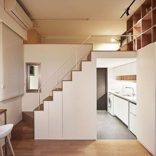
How to Optimize Small Spaces in Apartments and Houses
In this article, we will share valuable tips on how to optimize small spaces in apartments and houses.
 https://creativecommons.org/licenses/by-nc-nd/4.0/https://creativecommons.org/licenses/by-nc-nd/4.0/ArchShopArchShop
Cool colors are a category of colors that evoke feelings of calm, tranquility, and serenity.
Cool colors are a category of colors that evoke feelings of calm, tranquility, and serenity. They are typically associated with shades of blue, green, and purple, which evoke nature, ice, and water. Unlike warm colors, which convey energy and excitement, cool colors tend to create a more relaxing and refreshing atmosphere. These shades are often used strategically in art and design to create contrasts and convey specific emotions. In this article, we will discuss what defines a cool color, its various applications, and its presence in architecture.

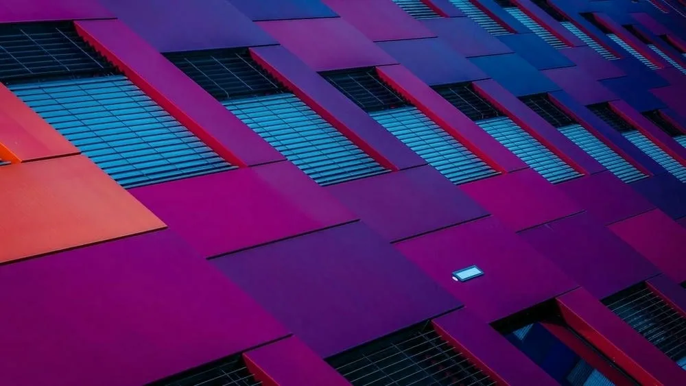
In architecture, the selection of colors plays a fundamental role in creating impactful environments and influencing the emotional experience of users. Cool colors are one of the design elements used to create specific atmospheres in architectural spaces. In this context, cool colors are those that evoke feelings of freshness, tranquility, and serenity, generally associated with shades of blue, green, and purple. In this text, we will explore the concept of cool colors in architecture and how they are used to create atmospheres and emotional impacts in built spaces.
Colors are perceived by humans through light and can evoke different emotions and sensations. The color wheel is often used to represent colors and is divided into warm colors (such as reds, oranges, and yellows) and cool colors (blues, greens, and purples). While warm colors tend to convey energy, enthusiasm, and warmth, cool colors have a softer and more relaxing quality.
The basic cool colors are green, blue, and violet.
Blue is traditionally considered the coolest color in the chromatic spectrum. However, the idea of “cool” and “warm” among colors can be subjective and varies from culture to culture. The idea of blue being the coolest tone on the color wheel comes from the associations we make with the color. For example, while red reminds us of fire - which is hot - blue reminds us of water or ice, which are cold.

To identify a color as cool, we can consider some aspects, such as hue, color temperature, brightness, and saturation, in addition to the emotional associations commonly attributed to cool colors. Let's look at each of these elements:
By considering these aspects together, we can identify a color as cool and understand how it can influence the atmosphere and emotions in architectural spaces. We emphasize that the perception of colors is subjective, and individual interpretation can vary. Therefore, analyzing the context and understanding the design intentions are fundamental to using cool colors effectively in architecture.
Cool colors have distinct psychological effects and can influence the mood, energy, and perception of occupants of a room in various ways. But what do cool colors awaken in people? Here are some common effects associated with these cool colors:
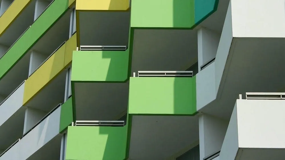
Green is often associated with nature, freshness, and tranquility. It can have a calming and relaxing effect on people, reducing stress and promoting a sense of harmony. Green is also related to renewal and growth, which can inspire feelings of hope and rejuvenation. In addition, green can be used to create a sense of balance and stability in an environment.
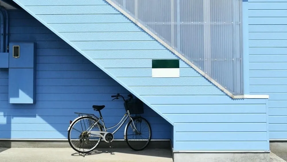
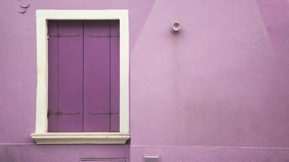
Blue is a color that evokes calm, serenity, and peace. It is often associated with the sky and the ocean, conveying a sense of expansion and tranquility. Blue can help reduce blood pressure and heart rate, promoting a feeling of relaxation. It can also stimulate mental clarity and concentration, making it a popular color for work and study environments. However, in darker shades, blue can create a more serious or melancholic atmosphere.
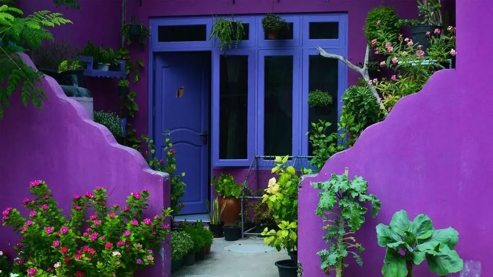
Violet is a color associated with spirituality, creativity, and mystery. It has a calming effect, similar to blue, but can also stimulate imagination and introspection. Violet is related to intuition and the search for deeper meaning. In therapeutic settings, it can be used to promote meditation and emotional connection.
We remind you that the intensity, tone, and combination of colors used can also influence how people respond to them. Therefore, it is essential to consider the desired objective and the specific context when choosing colors for an architectural environment.

In short, the use of cool colors in architectural projects requires a careful and strategic approach. Architects must consider highlight elements, paint, coatings, lighting, material selection, complementing with neutral and warm colors, as well as studying the context and target audience to create harmonious and visually pleasing spaces.
The presence of cool colors in human history plays a significant role in cultural expression and architecture around the world. The colors blue, green, and violet have unique characteristics that are valued by different societies, reflecting traditions, symbolisms, and aesthetic preferences.
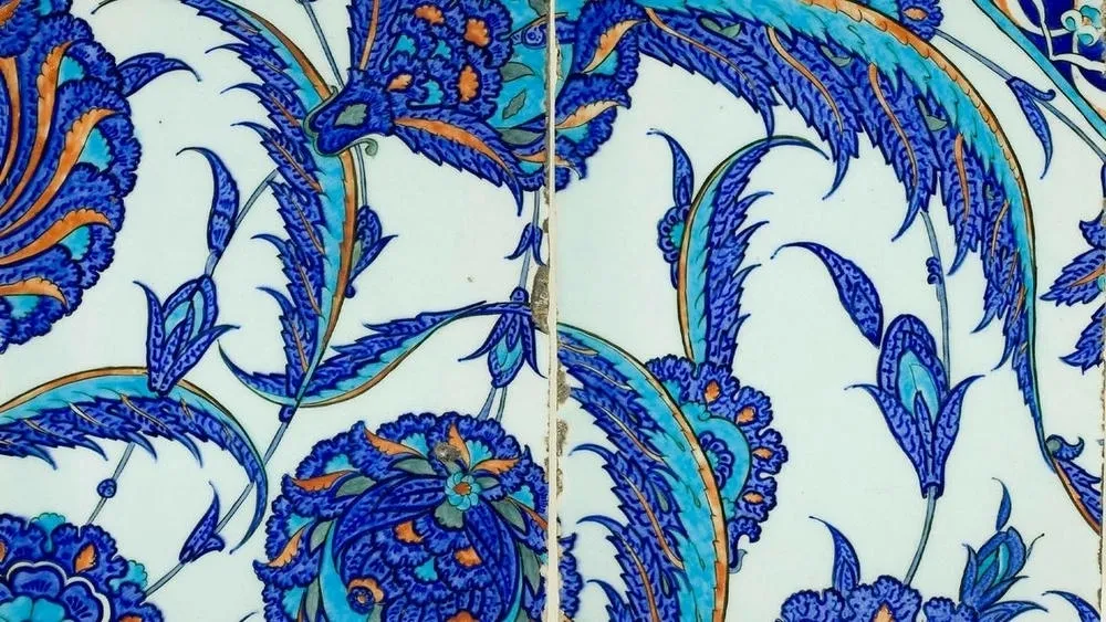
Starting with blue, this color is widely associated with tranquility, serenity, and spirituality. In many cultures, blue is related to the sky and the sea, elements that inspire a sense of spaciousness and peace. In Islamic architecture, for example, it is common to find blue tiles decorating mosques, palaces, and mausoleums. The blue tiles used in Islamic art are called "Iznik tiles" and are appreciated for their delicacy and brilliance. This color is also seen in Mediterranean coastal cities, where blue-whitewashed facades represent a traditional architectural style.
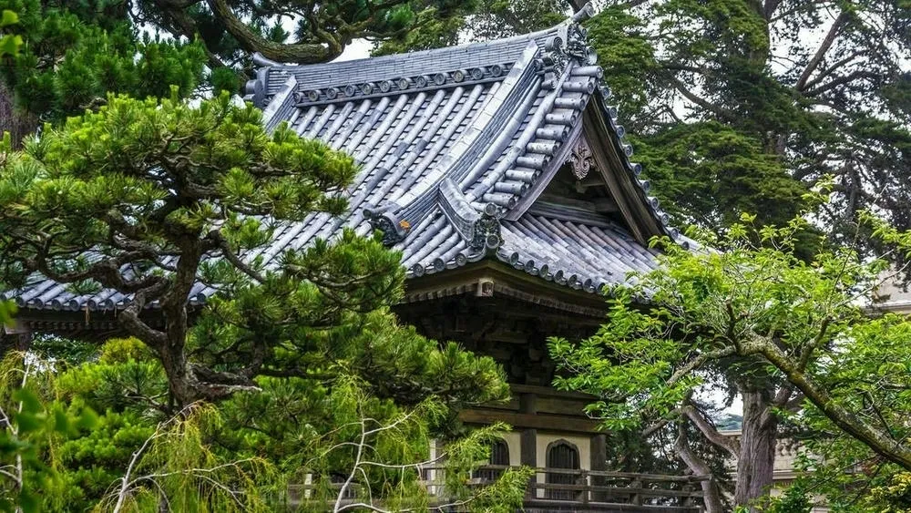
Green, in turn, is associated with nature, renewal, and hope. In many Asian cultures, green is valued as an auspicious color that symbolizes fertility and growth. In traditional Japanese architecture, it is common to find indoor gardens called "roji", where the color green is abundant. These spaces are designed to convey a sense of tranquility and harmony with nature. The use of plants, foliage, and the presence of green are also striking features of sustainable and ecologically conscious architecture around the world.

Violet, in turn, is a color that evokes mystery, spirituality, and creativity. In the history of art and architecture, violet has been associated with the sacred and the transcendental. A notable example is Gothic architecture, where violet stained glass is often found in large cathedrals. These stained glass windows, in addition to their practical function of allowing light to enter, are also used as a form of artistic and religious expression, evoking a mystical and inspiring atmosphere.
Throughout history, different cultures around the world have used blue, green, and violet in distinct and significant ways. These colors have the power to influence the perception and emotions of people who interact with the built environment, adding layers of meaning and beauty to architectural structures.
The use of cool colors in contemporary architecture has evolved significantly over time, reflecting current trends and innovative approaches to these colors. Cool colors, such as blues, greens, and violets, have traditionally been associated with feelings of tranquility, serenity, and coldness. However, the interpretation and application of these colors in contemporary architecture have become increasingly diverse and experimental.
In the past, cool colors were often used in interiors to create relaxing environments and spaces for contemplation. These colors were commonly used in settings such as spas, clinics, and rest areas, where a calming atmosphere was sought. The use of pale blues and greens was predominant in these applications.
However, today, cool colors are explored more comprehensively and expressively. Contemporary architects have experimented with more intense and vibrant shades of blue, green, and violet, bringing a new dynamic and energy to spaces. These colors are used not only in interiors but also on facades and external areas of buildings.
In addition, the combination of cool colors with other colors and textures has also become a common approach in contemporary architecture. The contrast between cool and warm colors, such as blue with orange or green with red, can create a striking visual impact and provide a stimulating environment. Architects have also explored the layering of different shades of cool colors to create depth and three-dimensionality in spaces.
A current trend is the use of lighting and technology to enhance the impact of cool colors in architecture. LED lighting offers a wide range of color and intensity options, allowing architects to create different atmospheres and alter the perception of colors throughout the day. Scenic lighting, for example, can transform a building into a dynamic canvas, where cool colors are used interactively and engagingly.
Other innovative approaches have explored the use of materials and construction techniques to incorporate cool colors into the very structure of buildings. Colored glass, ceramic coatings, and translucent facade panels are examples of architectural solutions that allow for the creative use of cool colors, giving a unique identity to constructions.
In architecture, cool colors play a significant role in creating cozy and harmonious environments. By incorporating shades of blue, green, and purple into architectural spaces, it is possible to create a relaxing and serene atmosphere. These colors are often used in resting places, such as bedrooms and leisure areas, where tranquility and well-being are sought. In addition, cool colors can also be used to highlight architectural elements, providing contrast and visual balance. By exploring the possibilities of cool colors, architects have the ability to transform spaces, creating environments that inspire serenity and invite contemplation.
 https://creativecommons.org/licenses/by-nc-nd/4.0/https://creativecommons.org/licenses/by-nc-nd/4.0/ArchShopArchShop
ArchShop is redefining the concept of residential architecture in Brazil, making high-quality projects accessible to everyone. Combining over 20 years of expertise in the construction sector with technological innovation, the company offers a complete digital platform that simplifies and democratizes the process of building the dream home.
See also
In this article, we will share valuable tips on how to optimize small spaces in apartments and houses.
Explore 23 projects with a gourmet space, from compact houses to high-end models with a pool and barbecue. Find the perfect plan for your home!
In this article, we will highlight the trends that continue to evolve, while also presenting some exciting new developments in the field of architecture, interior design, and decoration.
In the world of colors, there are three main categories that describe their visual and emotional characteristics: warm, cool, and neutral colors.
Advertise or Publish
We believe that the best ideas arise from the exchange of experiences and the sharing of different perspectives. Open the doors to new opportunities and be part of our blog! If you have an interesting article, an amazing work, a product or service that deserves to be highlighted, contact us.